Skip to content

Removing the New Event Button from Thunderbird v115 Calendar

DebianOpen Source

Thunderbird in Debian stable (Bookworm) has received Thunderbird v115.3.1 as a security update.

With it comes "Supernova", a UI redesign. There is a Mozilla blogpost with a walk-through of the new UI.

Unfortunately it features a super eye-catching "New Message" button that - thankfully - can be disabled. Even the whole space above the email folder pane can be recovered by disabling the folder pane header at Burger Menu (☰) -> View -> Folders -> Folder Pane Header.

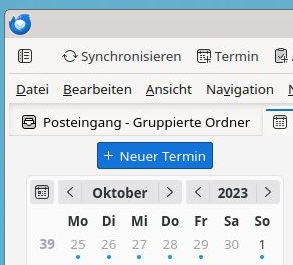
Unfortunately there is no way to remove the same eye-catching "New Event" button for the Calendar view via a UI setting.

Thunderbird New event button, German locale

This needs a user CSS file to override the button as non-visible.

To make it process the user CSS Thunderbird needs a config setting to be enabled:

  1. Burger Menu (☰) -> Settings -> General
  2. Scroll down all the way
  3. Click the Config editor... button on the bottom right
  4. Accept that hell will freeze over because you configure software
  5. Search for toolkit.legacyUserProfileCustomizations.stylesheets
  6. Toggle the value to true to enable the user CSS

You can manually add user_pref("toolkit.legacyUserProfileCustomizations.stylesheets", true); to ~/.thunderbird/abcdefgh.default/prefs.js to the same effect (do this while Thunderbird is not running; replace abcdefgh with your Thunderbird profile ID).

Now create a new directory ~/.thunderbird/abcdefgh.default/chrome/, again replacing abcdefgh with your profile ID.

Inside the new directory create a userChrome.css file with the following content:

/* Hide Calendar New Event button */
#primaryButtonSidePanel {
    display: none !important;
}

Restart Thunderbird. And enjoy less visual obstruction when using the Calendar.

Fixing the Nextcloud menu to show more than eight application icons

Internet

I have been late to adopt an on-premise cloud solution as the security of Owncloud a few years ago wasn't so stellar (cf. my comment from 2013 in Encryption files ... for synchronization across the Internet). But the follow-up product Nextcloud has matured quite nicely and we use it for collaboration both in the company and in FLOSS related work at multiple nonprofit organizations.

There is a very annoying "feature" in Nextcloud though that the designers think menu items for apps at the top need to be limited to eight or less to prevent information overload in the header. The whole item discussion is worth reading as it it an archetypical example of design prevalence vs. user choice.

And of course designers think they are right. That's a feature of the trade.
And because they know better there is no user configurable option to extend that 8 items to may be 12 or so which would prevent the annoying overflow menu we are seeing with 10 applications in use:
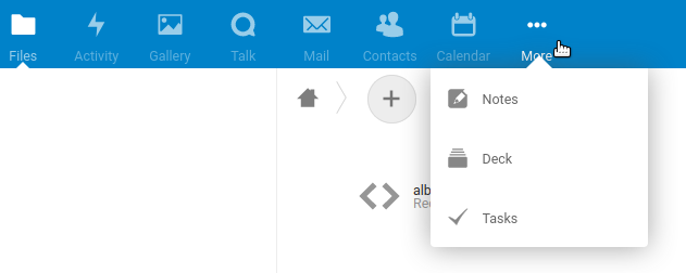
Screenshot of stock Nextcloud menu

Luckily code can be changed and there are many comments floating around the Internet to change const minAppsDesktop = 8. In this case it is slightly complicated by the fact that the javascript code is distributed in compressed form (aka "minified") as core/js/dist/main.js and you probably don't want to build the whole beast locally to change one constant.

Basically

const breakpoint_mobile_width = 1024;

const resizeMenu = () => {
    const appList = $('#appmenu li')
    const rightHeaderWidth = $('.header-right').outerWidth()
    const headerWidth = $('header').outerWidth()
    const usePercentualAppMenuLimit = 0.33
    const minAppsDesktop = 8
    let availableWidth = headerWidth - $('#nextcloud').outerWidth() - (rightHeaderWidth > 210 ? rightHeaderWidth : 210)
    const isMobile = $(window).width() < breakpoint_mobile_width
    if (!isMobile) {
        availableWidth = availableWidth * usePercentualAppMenuLimit
    }
    let appCount = Math.floor((availableWidth / $(appList).width()))
    if (isMobile && appCount > minAppsDesktop) {
        appCount = minAppsDesktop
    }
    if (!isMobile && appCount < minAppsDesktop) {
        appCount = minAppsDesktop
    }

    // show at least 2 apps in the popover
    if (appList.length - 1 - appCount >= 1) {
        appCount--
    }

    $('#more-apps a').removeClass('active')
    let lastShownApp
    for (let k = 0; k < appList.length - 1; k++) {
        const name = $(appList[k]).data('id')
        if (k < appCount) {
            $(appList[k]).removeClass('hidden')
            $('#apps li[data-id=' + name + ']').addClass('in-header')
            lastShownApp = appList[k]
        } else {
            $(appList[k]).addClass('hidden')
            $('#apps li[data-id=' + name + ']').removeClass('in-header')
            // move active app to last position if it is active
            if (appCount > 0 && $(appList[k]).children('a').hasClass('active')) {
                $(lastShownApp).addClass('hidden')
                $('#apps li[data-id=' + $(lastShownApp).data('id') + ']').removeClass('in-header')
                $(appList[k]).removeClass('hidden')
                $('#apps li[data-id=' + name + ']').addClass('in-header')
            }
        }
    }

    // show/hide more apps icon
    if ($('#apps li:not(.in-header)').length === 0) {
        $('#more-apps').hide()
        $('#navigation').hide()
    } else {
        $('#more-apps').show()
    }
}

gets compressed during build time to become part of one 15,000+ character line. The relevant portion reads:

var f=function(){var e=s()("#appmenu li"),t=s()(".header-right").outerWidth(),n=s()("header").outerWidth()-s()("#nextcloud").outerWidth()-(t>210?t:210),i=s()(window).width()<1024;i||(n*=.33);var r,o=Math.floor(n/s()(e).width());i&&o>8&&(o=8),!i&&o<8&&(o=8),e.length-1-o>=1&&o--,s()("#more-apps a").removeClass("active");for(var a=0;a<e.length-1;a++){var l=s()(e[a]).data("id");a<o?(s()(e[a]).removeClass("hidden"),s()("#apps li[data-id="+l+"]").addClass("in-header"),r=e[a]):(s()(e[a]).addClass("hidden"),s()("#apps li[data-id="+l+"]").removeClass("in-header"),o>0&&s()(e[a]).children("a").hasClass("active")&&(s()(r).addClass("hidden"),s()("#apps li[data-id="+s()(r).data("id")+"]").removeClass("in-header"),s()(e[a]).removeClass("hidden"),s()("#apps li[data-id="+l+"]").addClass("in-header")))}0===s()("#apps li:not(.in-header)").length?(s()("#more-apps").hide(),s()("#navigation").hide()):s()("#more-apps").show()}

Well, we can still patch that, can we?

Continue reading "Fixing the Nextcloud menu to show more than eight application icons"

Mozilla Firefox and Thunderbird Menu font sizes

Open Source

The font size Mozilla chose for Firefox and Thunderbird menus looks awfully large on Netbook screens. It wastes space and is visually at odds with reasonably sized content. And for some weird reason you can set the content font and size via the menu but not the font and size for the drop-down menus themselves.

As the "Theme Font & Size Changer" Add-On doesn't work reliably and phones home way too often (showing a nag screen), I dug back into how to do this "manually". Probably a decade after I fixed this the first time...

You need to create the file ~/.mozilla/firefox/*/chrome/userChrome.css with * being your profile directory (<random_number>.default usually) and you most probably have to create the chrome directory first.

The same for Thunderbird resides in ~/.thunderbird/*/chrome/userChrome.css. Here again the chrome directory will most probably need to be created first.


/* Global UI font */
* { font-size: 10pt !important;
  font-family: Ubuntu !important;
}
 

needs to go into these files for Firefox or Thunderbird respectively. The curly braces are important. So copy & paste correctly. Symlinks or hardlinks are fine if those files do not need to differ between your web browser and your email client.

Restart Firefox and/or Thunderbird to see the effect.

Obviously you can choose any other font and font size in the snippet above to suit your taste and requirements.

If you are massively space-confined and don't mind a quite ugly UI, check out the Littlefox Add-on. Ugly but optimal use of the minimal screen estate with very small screens.

Cool, command-line style blog design

Private

It's very seldom that a blog design catches my eye.

Screenshot of Pete Hindle's blog

Most common templates for blog systems like Wordpress or Serendipity are very well honed. Usability, accessibility and visual design of these systems and their default templates are are as good as it gets for the time being. Trying to do better usually fails. But Wordpress-CLI, which I found at Pete Hindle's blog manages to create a unique design. It may be inspired on the google shell (gosh) or older incarnations of the concept, e.g. WebCmd, but it is unique because it requires poking and trying stuff to expose the full functionality. A bit like an old school rogue-like game, it inspires playing with it to find out more. And it reminds nicely of command interfaces to BBS systems although the authors chose a syntax to resemble a unix based shell. You can try out different sub-designs at Rob McFarland's site. Obviously, usability still sucks, but it's worth it! Well done. And Pete: Please write some interesting entries in that blog now :-).